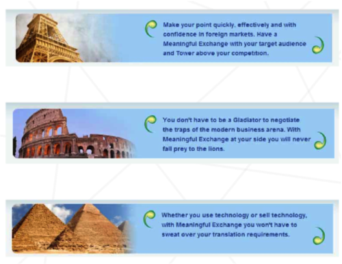
Creative Theme – Famous Man Made Landmarks



Creative Theme – Gambling
A Gambling theme was used for a management consulting member organisation to communicate with both prospective members and encourage membership and potential clients, with the main messages being:
To develop an effective creative theme, your brand positioning needs to be different from what is prevalent in your industry segment. One way of doing this is staying away from standard photography stock photos. Not only will this not provide your business with the necessary point of difference but will play into the hands of the category leader, who is most likely already using the “typical” stock shots.
Here are some examples of effectively used creative themes:
A Gambling theme was used for a management consulting member organisation to communicate with both prospective members and encourage membership and potential clients, with the main messages being:
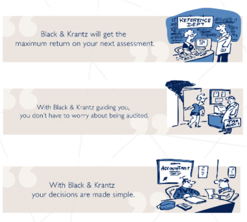
A Cartoon theme for an accounting practice and a different cartoon theme for a management consulting firm both poking fun at their own practice were used to differentiate these companies from their competition that uses traditional and boring “corporate” photos of “smiling people in the office”
A visual Illusion theme for a marketing consultancy was used to deliver the message that things aren’t always what they seem and that Perception is Reality!
A theme of the world’s most famous Man-Made Landmarks was developed for a translation company to differentiate them and make their offer more memorable than their competitors.
A Car theme was designed for a web marketing company that was at the time an early developer of an easy to use web Content Management System:
A Medical theme was developed for an I.T. company. Most I.T. companies can’t get beyond the now “typical” I.T. Health Check. This I.T. company was able to develop a campaignable and timeless theme which was intrinsically linked to its Positioning Statement / slogan which was “taking care of I.T.”
Wild West theme was used by a design firm, with all the shoot outs, outlaws, sheriff and wanted posters to create a fun approach to selling this firm’s point of difference.
As you can see the creative theme for your business is only limited by your imagination. From police or detectives, to aliens and UFO’s, from tailoring to sailing, from army to mythology, the critical things to remember are:
To develop an effective creative theme you need to be different from what is prevalent in your industry segment. One way of doing this is staying away from standard photography stock photos. Not only will this not provide your business with the necessary point of difference but will play into the hands of the category leader, who is most likely already using the “typical” stock shots.
Here are some examples of effectively used creative themes:
A Gambling theme was used for a management consulting member organisation to communicate with both prospective members and encourage membership and potential clients, with the main messages being:
A Cartoon theme for an accounting practice and a different cartoon theme for a management consulting firm were used to differentiate these companies from their competition by poking fun at the whole industry rather use traditional and boring “corporate” photos of “smiling people in the office”.
A visual Illusion theme for a marketing consultancy was used to deliver the message that things aren’t always what they seem and that Perception is Reality!
A theme of the world’s most famous Man-Made Landmarks was developed for a translation company to differentiate them and make their offer more memorable than their competitors.
A Car theme was designed for a web marketing company that was at the time an early developer of an easy to use web Content Management System:
A Medical theme was developed for an I.T. company. Most I.T. companies can’t get beyond the now “typical” I.T. Health Check. This I.T. company was able to develop a campaignable and timeless theme which was intrinsically linked to its Positioning Statement / slogan which was “taking care of I.T.”
Wild West theme was used by a design firm, with all the shoot outs, outlaws, sheriff and wanted posters to create a fun approach to selling this firm’s point of difference.
As you can see the creative theme for your business is only limited by your imagination. From police or detectives, to aliens and UFO’s, from tailoring to sailing, from army to mythology, the critical things to remember are:
Recent Comments